First of i searched for gaming event posters which I liked;
This is a really nice poster, the colours and overall design stood out to me it looked simple but yet full of creation. To me it also looked very retro which is my main aim for my poster.

This poster is really cool, simple colours but yet it gives you an arcade/retro feel. This design was just clever and seemed do able.


This poster looked good the use of the background looking pixel based and the old retro controller really resinated with me and drew my eye straight to it.

video games nation poster looked really good, it was almost a collage and it looked busy. This poster drew my eye to it when I saw this poster online and i think thats really the main aim of a poster.

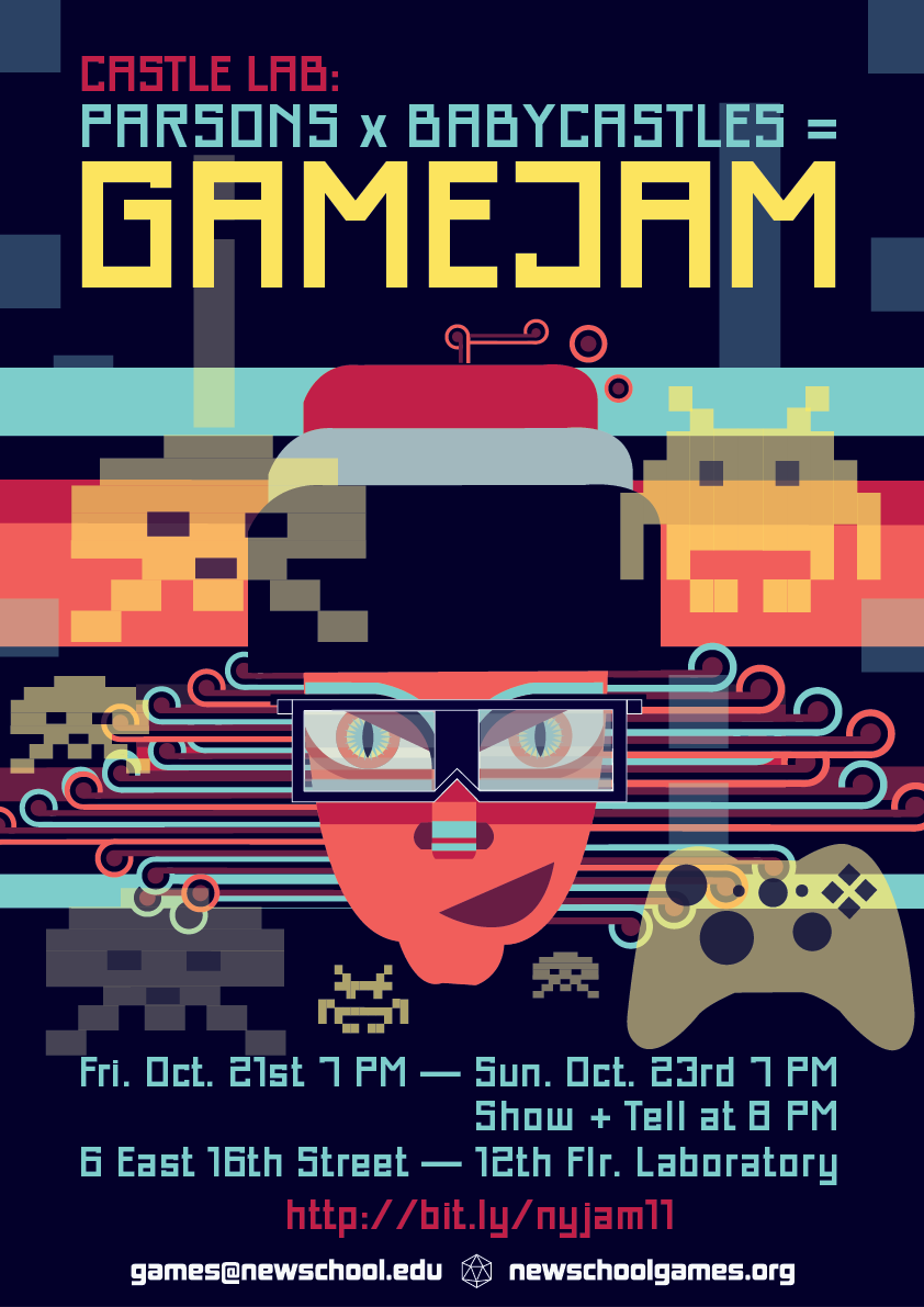
This some what futuristic poster stood out it seemed like it was out of a game and looked really 50's.


This poster isn't really an event based poster but it used something out of a game which i liked and i may use in mine, it is also humourous to some people if they have played the game or see the funny franchise on the bottle.

This used one base colour and then just white text a simple but yet effective poster.

This is similar to the previous but in more detail and its not really an event poster but i think the design and the use of text and the sword would be seen in a good light by other games.


This poster looked liked the front of a magazine but the colour and layout were really good.

This is just a simple picture of a lot of the controllers used within gaming, it was simple and a flat colour based poster, i liked the simplicity of the poster.

I really like colours like this where they use a lighter shade of it within the poster. The writing font is also good.

This isn't an event based poster but i like the art in it it was vibrant and really did stand out like every poster should.
Ive been drawing many designs in my sketch book for my poster design which I hope to upload and I have been trying to make fonts too.
My final piece in my opinion is good, I think nits simple but retro.

It wasn't too hard to create when once I had a good idea of what I wanted to accomplish, sometimes I would encounter problems on illustrator but over all I found it quite simple.
I have chosen this simple font as I feel sometimes it can be overwhelming on some posters when too much is going on, also i placed them all horizontally as i didn't want this to be overly complicated i wanted it to catch the eye of a passer by and them to bread it not be confused by it.
The shapes at the bottom in honesty were really random, I just made the shapes and thought that they seems cool and I could maybe use them to good use adding colour to intwine them with the poster.
Ive also added the information to where I think it is best suited, adding a raffle prize to show some realism.
overall I think I have made a good looking poster, using both research and my own skills to good use when creating the poster.
Well, that’s a good way to put it, nice insights, works great in clientele explanation and information resource option.
ReplyDeleteExhibition Services in Saudi
There are a tonne of vital details on your blog. I'm delighted you shared such valuable information with us. I appreciate you sharing such an informative article.gaming poster
ReplyDelete